Project Overview
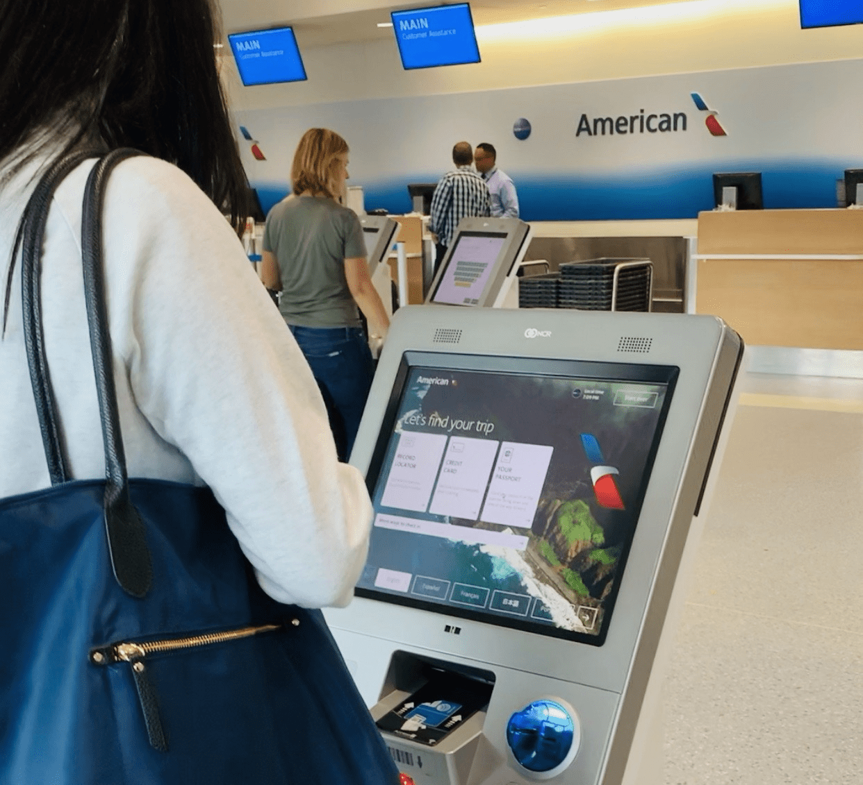
As the Senior Product Designer at American Airlines, I spearheaded a pivotal transformation project targeting the modernization of the airline’s kiosk system. This endeavor enhanced the user experience, ensured brand consistency, and improved operational efficiency, reducing 579 unique screens to 119 within AA’s self-service infrastructure. Leading a multidisciplinary team, we embarked on a journey to streamline the check-in process, foster internal collaboration, and align the kiosk experience with American Airlines’ overarching brand identity.
The Challenge
The primary challenge was to address the operational inefficiencies and design inconsistencies plaguing the existing kiosk system. Amidst an organizational restructuring, we faced the daunting task of consolidating the myriad of screens, enhancing peer-to-peer training for skill development, and ensuring a cohesive user experience. The goal was to enhance user satisfaction, streamline the check-in process, and seamlessly integrate the kiosk system with AA’s brand standards.
Problems
- Operational Inefficiencies: The kiosk system was plagued with design inconsistencies and a bloated inventory of screens, leading to confusion and delayed interactions.
- Lack of Brand Consistency: The disjointed user experience did not align with American Airlines’ brand, diluting customer trust and brand loyalty.
- Inadequate Training Mechanisms: The absence of structured peer-to-peer training hindered team development and collaboration, impacting the overall project delivery and quality.
Issues
- 579 Unique screens needed to be migrated.(~144 Scenarios)
- Undocumented UI components and patterns
- Undocumented User-flows
- Design Inconsistencies (font size, spacing, patterns, etc)
- There is no standard terminology for components or products
Misaligned alignment

Early in planning, there was a disconnect between where we were in maturity and where the team began planning. Almost every step required some backlog work to get us where we thought we were.
Value of the Project
For Users
The redesign offered a more intuitive, efficient, and satisfying interaction with the kiosk, enhancing the overall travel experience.
For American Airlines:
The project fostered brand consistency, improved operational efficiency, and positioned AA as a leader in customer service innovation.
The Solution
Our approach to resolving these challenges was multifaceted, multiphased approach focused on:
- Enhancing User Experience: We consolidated UI elements and standardized the user journey to reduce cognitive load and elevate user satisfaction.
- Operational Efficiency: We targeted reduced screen redundancy and optimized resource usage through a streamlined design and development process.
- Brand Consistency: Aligning the kiosk experience with AA’s design systems was crucial for reinforcing brand identity and fostering passenger loyalty.
- Accelerating Development Cycles: Creating an MVP design system and a production library facilitated rapid feature deployment and iterative updates.
- Improving Check-in Process: We prioritized the redesign of screens that facilitated successful check-ins to ensure a seamless experience for passengers.
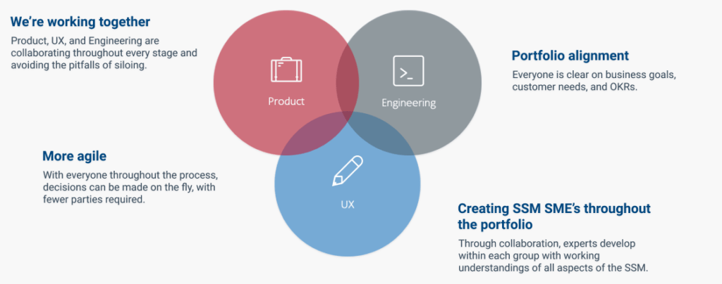
UX + Dev + Business
RESEARCH & STRATEGY
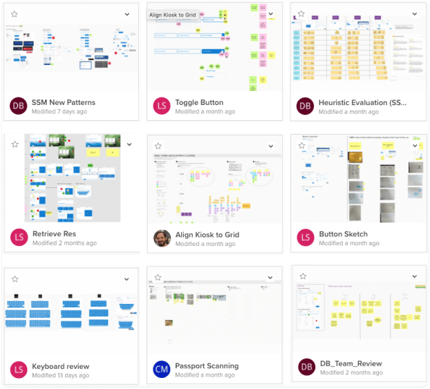
Leveraging Mural for collaborative design thinking exercises, our team conducted extensive research to identify inefficiencies and areas for improvement. This phase led to insights into siloed operations, the need for pattern consolidation, and the importance of clear UI elements.
Design Principles
Leverage the brand and previous work:
The kiosk design needs to align with the same style as AA.com. The kiosk should feel like an extension, not a new experience.
Less is more:
Focused on minimizing the cognitive load on-screen.
Reduce overthinking opportunities.
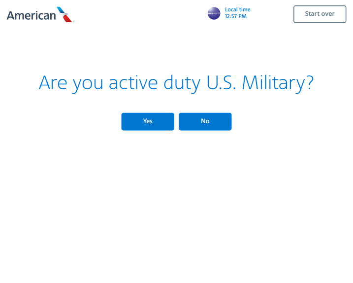
Reduce complex questions to “yes/no” style questions. Avoid anything that can be confusing.
Define the style and reign in anarchy.
Standardize the design and create balance and alignment with American Airlines’ overall digital experience.

OUTCOME
Define the style and reign in anarchy.
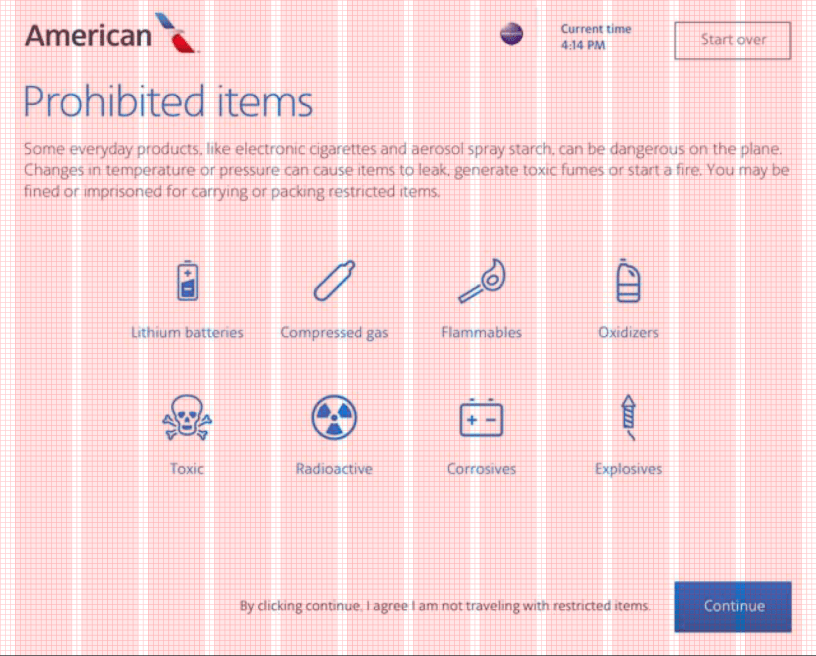
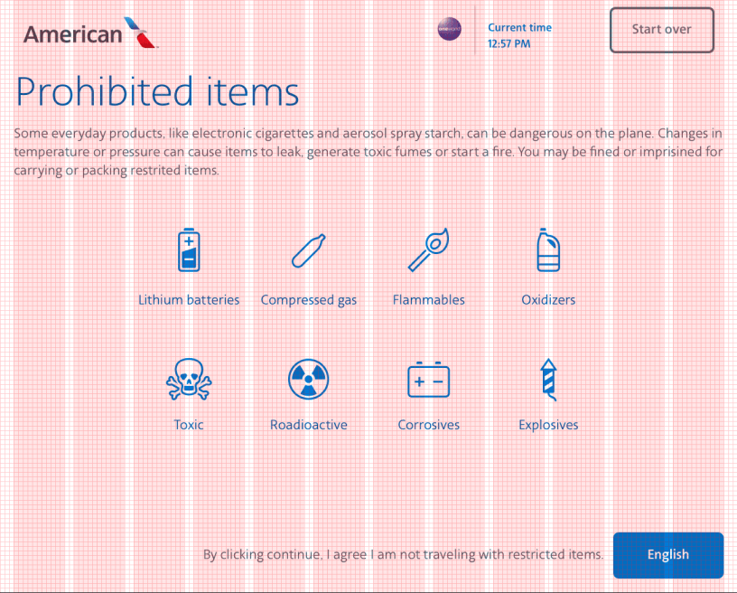
In order to create consistency across designs, we defined the typography using existing design patterns on the website including incorporating an 12 column grid, and moving toward a flex 8 point grid.

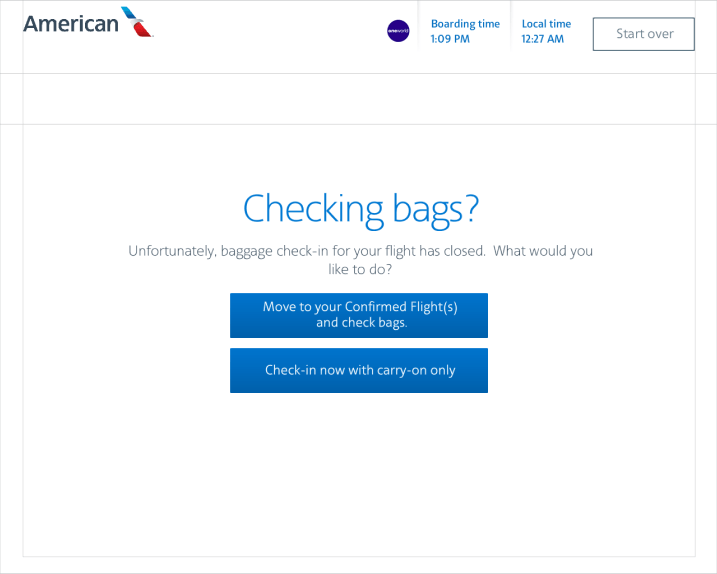
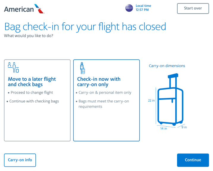
Updated “Bag check closed” screen
The original design required too much attention to details and not clear to the traveler. Focusing on minimizing the cognitive load, we reformatted the layout and added clarity with graphics.

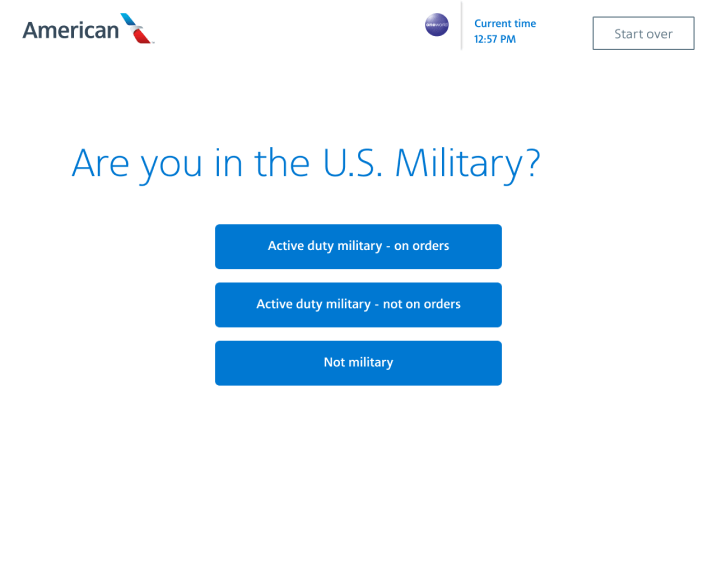
Reduce overthinking opportunities.
Reduce questions to “Yes”/”No” simple answers.

Impactful Deliverables
- Subject-Matter Expertise Development: I cultivated expertise within the Day Of Travel Team, empowering them with the knowledge and tools needed for ongoing innovation.
- Peer-to-Peer Training: Spearheaded training initiatives using Figma and provided comprehensive product design sessions, significantly enhancing team collaboration and skill sets.
Because of the work to documented all production screens, optimise work flows, reduce redunancies and build reusable components, we were able to reducing screen count by 66.5%, and developed an essential toolset for accelerated development cycles.
MVP Design System and Production LibrarIES
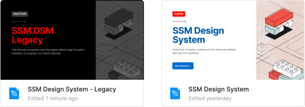
Documented Legacy and Current DSM
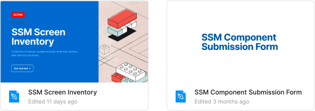
Design inventory mirroring production
Conclusion
The American Airlines kiosk transformation project is a testament to the power of strategic design thinking, cross-functional collaboration, and user-centered innovation. By effectively addressing the initial challenges, we not only streamlined the check-in process and enhanced operational efficiency but also significantly improved the overall user experience. This project reinforced American Airlines’ commitment to customer service excellence and established a solid foundation for future design and development endeavors within the organization.
By the end of the year, we’d met our target deadline while creating a strong system for improvement in the future by creating a patterns library and building a design system. We were able to design a seemless and consistent experience that aligns with all American Airline customer facing channels.
Yesterday
- Legacy platform
- No design system
- Unknown user flows
- No SME’s in Business, IT and Design
Today
- The platform is cloud-based
- Immature design system
- Screen repository of all SSM screens
- SME’s across the portfolio in Design, IT, and Business.
Tomorrow Ready
- Future-ready design system
- Platform branding is consistent with AA’s experience across other platforms.

